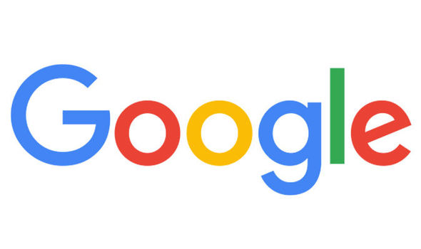
Google announced on its official blog its new logo and identity family that will work better not only on a single desktop browser page , but on various types of devices. “Once upon a time, Google was one destination that you reached from one device: a desktop PC. These days, people interact with Google products across many different platforms, apps and devices—sometimes all in a single day. You expect Google to help you whenever and wherever you need it, whether it’s on your mobile phone, TV, watch, the dashboard in your car, and yes, even a desktop!,” according to a Google blog post by VP and Product Management Tamar Yehoshua, and Director of User Experience Bobby Nath.
The new logo that has dropped the ‘serif’ style, according to Google, is “simple, uncluttered, colorful, friendly,” and shows the best of the tech company that has recently rebranded itself as Alphabet. Besides changing its look, Google has made a few other changes that will make Googlers’ experience more enjoyable and helpful. “It doesn’t simply tell you that you’re using Google, but also shows you how Google is working for you. For example, new elements like a colorful Google mic help you identify and interact with Google whether you’re talking, tapping or typing,” it was written on Google’s official blog. “Meanwhile, we’re bidding adieu to the little blue “g” icon and replacing it with a four-color “G” that matches the logo.”
Trying to make its new look appear friendlier, the web giant, instead of making the new logo cleaner and more simplified, has gone for a bolder look and emphasized circles. “Digital interfaces can be scary for a lot of people,” said Cooper director of product strategy Nate Clinton for Wired. “Google has a big challenge with both their public perceptions and new anxiety-producing technologies … so I think they want to project a tone and make people feel like they are more human and less about being in the guts of the computer,” Clinton added.
The very last change of Google’s logo was made in September 2013, but the recent look seems to be one of Google’s biggest changes to its logo since 1999. “This isn’t the first time we’ve changed our look and it probably won’t be the last, but we think today’s update is a great reflection of all the ways Google works for you across Search, Maps, Gmail, Chrome and many others. We think we’ve taken the best of Google (simple, uncluttered, colorful, friendly), and recast it not just for the Google of today, but for the Google of the future,” Yehoshua and Nath wrote on their blog post.